circular layout of more than one panlemaps
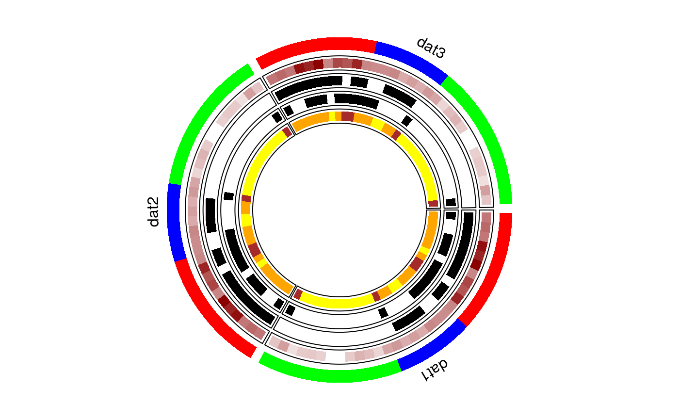
circomap.Rdcircomap plots multiple cohorts having grouped data in the form of a panelmap laid out in a circular fashion. Each pie reflects the relative size of each cohort, and each track is a panelet summarizing a feature.
circomap(datasets,gtoplot,gcol,gheight,ftoplot,ftype,fcol,fheight,
NA.flag="FALSE",NA.col="grey")
Arguments
| datasets |
list. Arrange the datasets to plot in a list. Each dataset has samples as columns and features as rows. The row features should be uniform across datasets. See |
|---|---|
| gtoplot | character. Name of the group variable to plot. |
| gcol |
vector. Color to be assigned to each group in group labels. |
| gheight |
numeric. Height of the group label panelet track. Default is |
| ftoplot | vector. Names of the features to plot. See |
| ftype | vector. Type of data type to be plotted in |
| fcol | list. A list of color values to be coded. Names of the list are same as |
| fheight | numeric. Height of each of the panelet track. |
| NA.flag | logical. default is FALSE. If there are NAs in your categories set it as TRUE |
| NA.col | character. Default is "grey". Set the color for NAs |
Details
The radius of circomap is 1. Heights of gheight and fheight should be chosen accordingly.
Value
returns a circomap
References
Gu, Z. circlize implements and enhances circular visualization in R. Bioinformatics 2014.
See also
makepanel
Examples
#dataset 1 dat1 = mtcars[order(mtcars$cyl),] #dataset 2 dat2 = mtcars[order(mtcars$cyl),] #dataset 3 dat3 = mtcars[order(mtcars$cyl),] #put all the datasets in a list datasets<-list() datasets[[1]]=dat1; datasets[[2]]=dat2; datasets[[3]]=dat3 names(datasets) = c("dat1", "dat2", "dat3") #names of datasets will be used to labek the datasets #group variable to plot same as panelet_group gtoplot<-c("cyl") gcol = c("red","blue","green") gheight = 0.10 #track height of the group variable #features to plot - same as in panelmap example ftoplot<-c("mpg", "vs", "am", "gear") ftype= c(2,1,1,1) fcol=list(am=c("white","black"), vs=c("white","black"), gear=c("yellow","orange","brown"), mpg=c("white", "darkred")) fheight<-list(); fheight[1:length(ftoplot)] = 0.08 #Voila!! circomap(datasets, gtoplot, gcol, gheight, ftoplot, ftype, fcol, fheight)#>#>#>